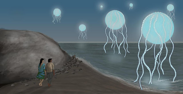
Tutorial 010 Backgrounds / Landscapes (Gimp)
Whenever I create an exterior shot I always think in terms of four layers of depth: the foreground, midground, background and sky. This establishes a nice 3 dimensional depth to the image.
We will start with the most distant - and therefore lowest - layer, and work forwards.
Your sky can be flat and featureless, or it can have subtle shades of colour, and of course clouds. Let's start with a summery blue sky. In daytime we will mostly see one shade of blue. Just after sunrise or just before sunset the sky near to the sun will be a lighter shade of blue, gradually blending into darker shades higher up.
You can create this gradation quite simply. Take the paintbrush tool and increase the size, then pick a fuzzy edge. Now choose a lighter shade of blue. About halfway down the panel paint this across. Now go to blur, gaussian and increase the intensity until you get the desired effect. This is a very easy way to get that 'airbrushed' effect.
You can create a stormy or overcast effect by mixing up shades of grey in a similar way.
For clouds create a new layer and use an irregular tool point. Change to a fuzzy round tool and use smudge to blend over this in circular motions for a wispy cloud effect.
With a landscape you are creating a sense of a much larger space, and to do this we can use techniques that mimic real optical effects. The further away an object is, the less detailed it will appear. So, for the next layer - the far distance - we want a fairly simple design. Create a new layer and - for mountains - draw a simple outline, fill in the colour, maybe add a little detail, not too much. Remember the colours should not be too strong.
This layer establishes the level of the horizon, so think about where to place it vertically. Don't place it right in the centre as this is not visually appealing; decide which is more interesting; the sky or the ground, and give that more space. It looks better if the sky takes up 1/3 or 2/3 rather than one half of the image. Photographers call this “the rule of thirds”
For a forest background you only need the line of the tops of trees. Use an irregular tool tip and mark out an irregular line in a dark green. Now make the tool smaller, turn the colour down close to black and put in some shadows here and there.
Use a fuzzy smudge to soften the details.
The midground and foreground can have more detail and you don't always need to have a sharp division between them, but keep them on separate layers so that you can make changes to each one if you decide to.
Buildings are another common feature of landscapes, but I will deal with those in another video.
INTERACTION
If your characters interact with the background it makes both of them look more real. Just a simple thing like adding a shadow on the ground, or - the opposite - reflection of light on the character's face, something to link them together. It anchors them to the scene and creates a more genuine feel.
FOCUS BALANCE
A detailed background is a nice touch and can be very rewarding for your reader, but bear in mind that - usually - you do not want it to drown out your foreground. If the background is too "loud" (bright or colourful) or too "busy" (detailed) your characters can get lost in the noise. But don't panic, you can easily remedy this by toning down the background: gaussian blur, make it lighter or darker and reduce the colour saturation.
OVERLAYING
Sometimes you want elements of your background to be in the foreground. For example, a person seated at a table. One way to do this is to put the character image on top and then cut out the parts where you want the foreground to show through. You can see through the image by reducing the opacity. Select the parts you want to delete, then clear. Now turn the opacity back up again.
Another way is to create a new layer with the foreground object and lay this on top of the middle layer.
For example, for a railing which is part of a model, you want the characters behind to be visible in the negative spaces. You ALSO want the floor to be visible in the layer behind them, which is the bottom layer.
Now, I can put the characters on top, make them translucent and cut out the parts I don't want...
But what if I change my mind and want to reposition them? It would be better to have a layer of this railing on top with the negative spaces already removed.
I will do this by selecting the railing within the image. It is very important to include the top left corner of the image, and you will see why soon.
Copy, paste as new image. Now here I can remove the negative spaces. If the floor is one solid colour I can easily select and edit, clear. If it is a more complex texture, that might be more difficult, so I will use the lasso tool to mark out the areas I want to delete.
Back to the original, put your characters roughly where you want them to be...
Now go to the railing image and copy.
Back to the original and paste IN PLACE - this will place it perfectly where it was originally copied Tutorial.Backgrounds.odt from. But this only works if you included the top left corner when you copied it from the original. This is how Gimp positions the pasted image horizontally and vertically.


Comments
Post a Comment